Undergraduate Work Portfolio
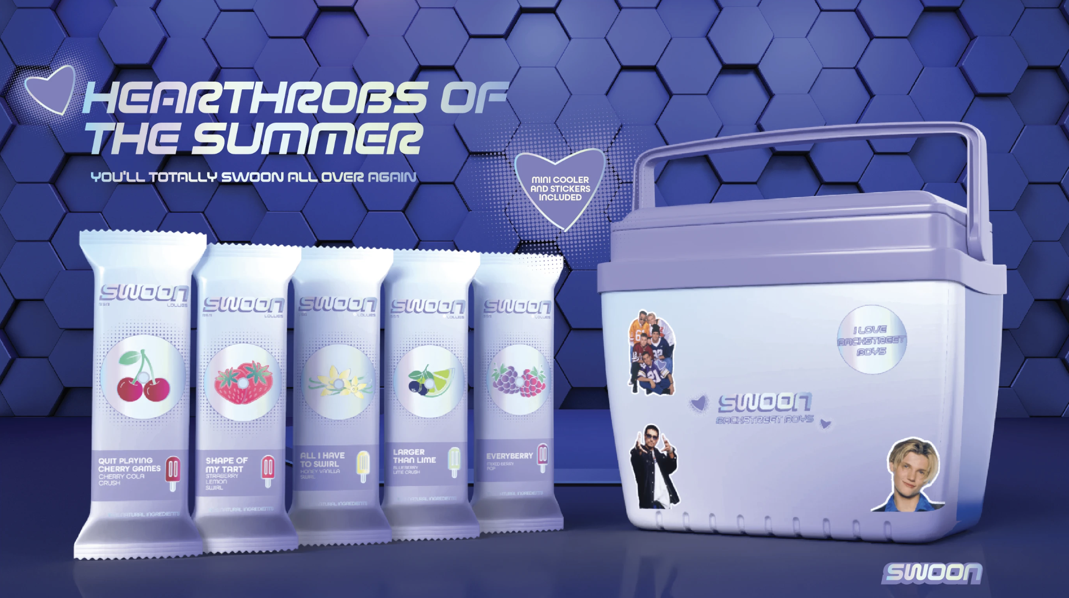
The first thing I thought about when this project was presented to me was boybands and their devoted fangirls. Although I was not alive during their prime, I did grow up during a time where boy bands debuted left and right, and stole the hearts of millions of girls all around the world. I remember the useless stuff I would beg my parents to buy just because Harry Styles face was plastered on it. So for this project, I wanted to play into that narrative and brand the Backstreet Boys ice cream brand for their fans to remember the times where they would make collages of their favorite Backstreet Boy, and their old CD collection. I took inspiration from the early 2000s tech aesthetic. I wanted it to feel nostalgic and dreamy and capture that futuristic feel of the early 2000s. I also wanted the packaging to also be a collectable, my idea was for the lollies to come in a mini cooler bag. Because my demographic would be older women millennials, I wanted the the collectable to be a functional item, the mini cooler bag would convince them to buy the lollies. And if they wanted to buy all 5 flavors, they can get all of them inside a mini limited cooler that would come with stickers that fans can put on the cooler.
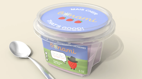
Yogurt x Tim McGraw Packaging Mockup I was instructed to create a yogurt packaging design that took inspiration from the famous country singer Tim McGraw. Let me begin by prefacing this: Tim McGraw and I are from very different parts of the U.S. That being said, I did some research into Southern culture to get a better understanding of Tim McGraw as a person. I found that he was from Louisiana, and laid a foundation for my project by creating a brand guideline that showcased Louisiana's nature and local diction. In Cajun English, "Bon Ami" means "good friend" while "Mais cher" roughly translates to "well, darling"
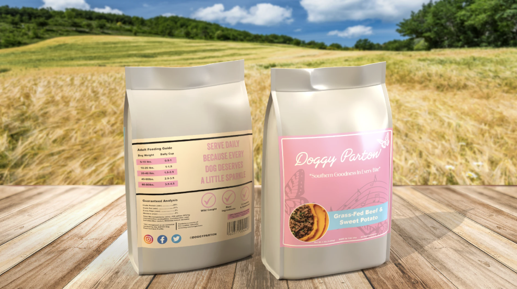
In our class we were tasked to create a certain product that was connected with a certain celebrity. The celebrity that was given to me was Dolly Parton and my product was dog food. I thought these two matched up pretty well because Dolly Parton is singer form the South who grew on a farm and is very into nature/animals. I wanted the product to pop and stand out like Dolly because sparkle and standing out pretty much correlates with her. I wanted something to stand out but nothing obnoxious. Something that would pop but also somewhat modern to appeal to the younger generation but still enough to captivate and easy to recognize for the older generation that grew up with Dolly Parton. For the final design/substance 3D modeling I went with a nice field to create this feeling that you are in the South right off the farm. Gave the whole vibe some warmth just like Dolly Parton because of how down to earth she is and her connection with animals and nature. It would not have felt right to have her product in modern day coffee table or kitchen.
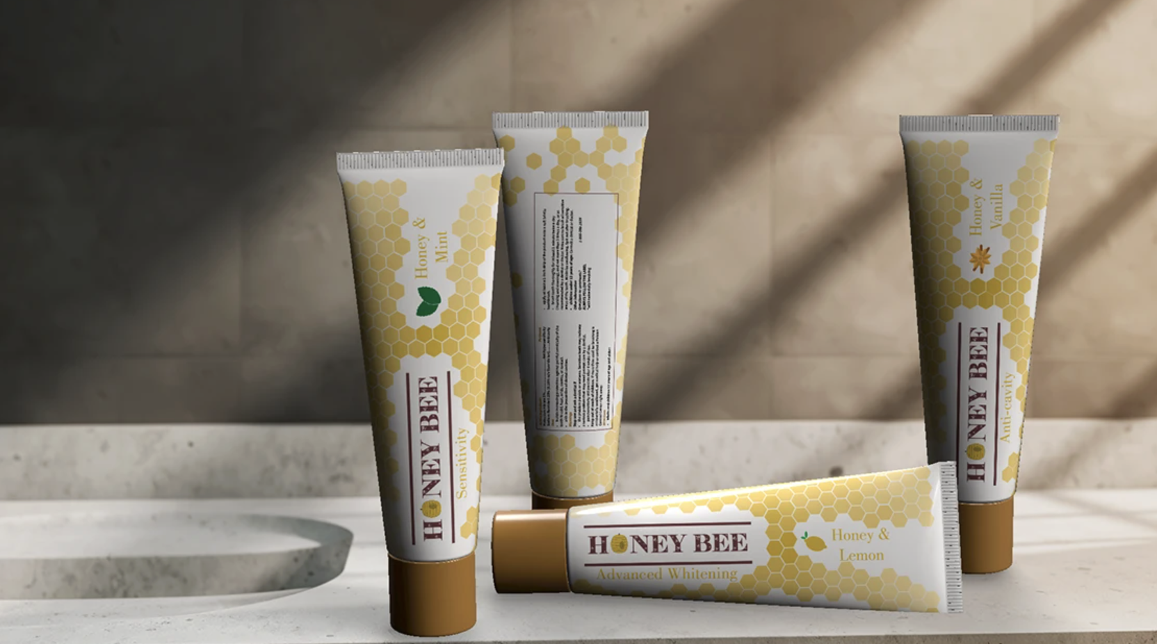
With the main ingredient being honey for this product packaging, I had thought it would be a great idea to incorporate that within the packaging. By adding it around the toothpaste, I had each of the honeycomb symbol start from dark and lighten up as it spread out while adding attention to the label name and flavored toothpaste it is advertising. The tricky part was finding the right angle for the ingredient portion of the toothpaste because of how the toothpaste was curved, it couldn't accurately sit the way I expected too so it was a lot of trial and error.
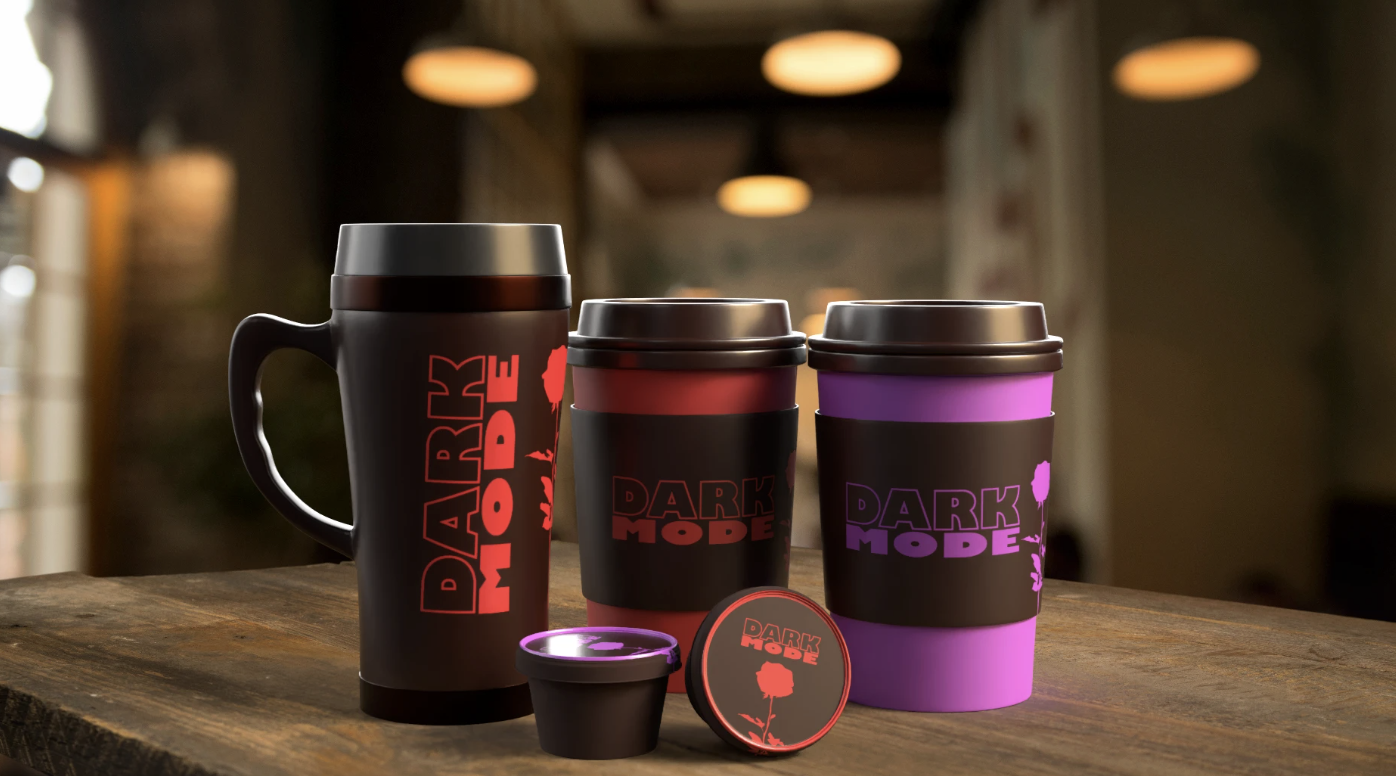
For this project, I was assigned to create a coffee brand based on the band Depeche Mode. I call this brand, "Dark Mode." Below are my design guidelines. For colors, I decided to limit myself to to only three: Purpurerus, Licorice, and Fire Engine Red. As for visuals, I kept it simple with a single rose, which is actually based on their most popular album, Violator. By using Adobe Illustrator, I created these designs for cup sleeves, a portable cup, and k-cups for coffee makers.
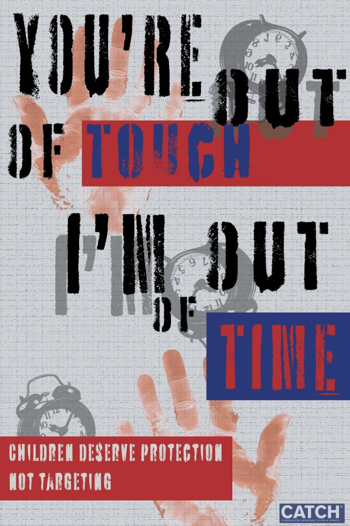
I decided to focus my posters on the reoccurring issue of children developing nicotine addictions, specifically with vaping products. As someone who used to work at a high school, I recognize how easy children and teenagers have access to harmful drugs and wanted to shed light on the topic! I used the songs "Forgotten" by The Plot in You, "Where's Your Head At" by Basement Jax, and "Out of Touch" by Daryl Hall & John Oates. These songs do not specifically speak about the issues I am focused on but I felt that it could be used in the message I am trying to send with a punk/alternative style. Then at the bottom of each poster also brings a Call to Action as well as the organization, CATCH. It is a "Coordinated Approach To Child Health" that educates those about nicotine and it's harm to children's health. These were made with Adobe Illustrator and Photoshop.
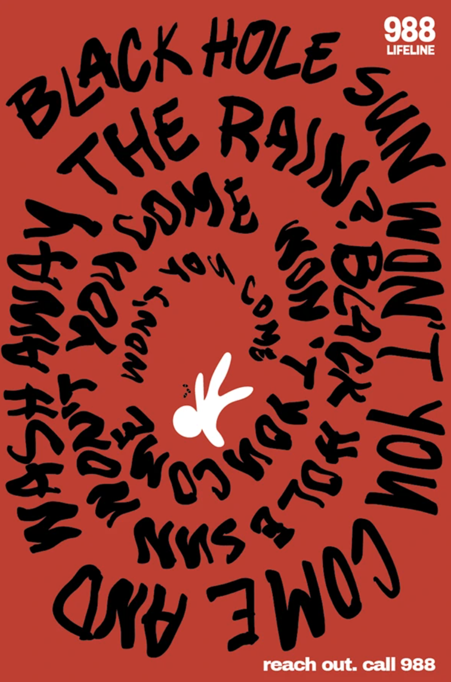
The subject that I chose was on teen to young adult mental illness. I wanted to create posters on how a lot of people go through mental illness everyday and never really talk about it to anyone else. Others romanticize mental illness just because they think its cute and or quirky but not know what it actually does to people and how it effects them in their everyday lives I wanted to create a sense of chaos/messiness within these posters to create a sense of anxiety and or mix thoughts within the poster to make it seem like it was someones thoughts.
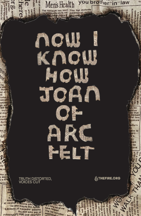
This series ends not in chaos, but in silence. Imagining a world where censorship has completely erased our voices completely, depriving our humanity. Created as a response to the prompt exploring social issues that threaten our future, I chose to confront the erosion of free speech through censorship. This project reflects my fear of a world where our voices are erased and the world becomes silent. Rather than focusing on the physical damage, I examined the quieter apocalypse that begins with redacted truths and ends in total silence. Song and Lyric Choice: "Now I know how Joan of Arc felt" Song: Bigmouth Strikes Again! by The Smiths
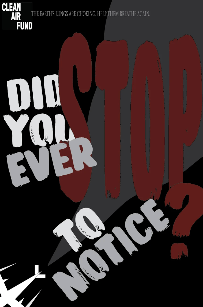
For this project, I was asked to create a typographic poster using Adobe Illustrator as my tool. I used song lyrics of my choice to promote environmental and social justice issues through my posters. I decided to focus on the issue of air pollution as that has been a prevalent topic in modern day. The organization I researched was the Clean Air Fund, an organization working to create a future with clean, breathable air. 1.Earth Song x Michael Jackson (1995)“What have we done to the world, look what we’ve done.”“What about all the peaces that your pledge your only son?”“Did you ever stop to notice this crying Earth, these weeping shores?”
For this exercise, I was tasked with using generative AI and creative thinking. Each prompt required me to explore how to navigate AI tools in order to generate different images of cheese, both visually and symbolically, through creative thinking. I examined a variety of cheeses and tested different scenarios that could engage my audience. After gathering imagery, the assignment then asked us to design one poster for each of our ten prompts, including a headline, body text, and tagline.

The task was to AI-generate 10 cheese-themed text prompts and create 5 variations of each. I chose the best generated image from each theme and have headlined 5 of them. Final iterations are shown below the variations.
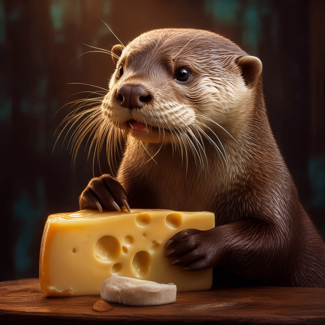
For this assignment we were asked to create 50 AI posters about cheese in any form. We were asked to create 10 different prompts for cheese and create 5 for each prompt and choose the the best one out of each prompt to showcase.
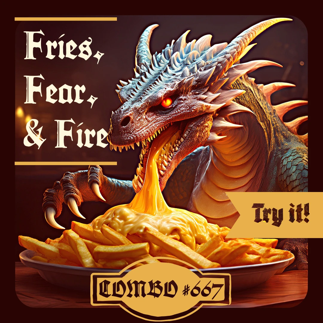
I was instructed to come up with 50 versions of cheeses. With 10 prompts, I choose 5 best photos from the prompts and created 1 final photo to be edited! I hope you enjoy :)

The story I wanted to tell was about feeling out of place in time, as if you were born too late and are not meant for this current time. I wanted to tell this story because I often feel like I would have enjoyed my life more if I had grown up sometime in the 90s or the early 2000s since I always find myself attracted to the aesthetics of that time, such as the fashion and technology, even the advertisements.
It took time, trial and error, to truly sit down and see myself from an outside perspective. Through self-reflection, I realized that from a very young age I struggled with the idea of femininity. Growing up as a tomboy, I lacked the confident in my feminine features and carried insecurities that held me back from fully growing as as individual. As I grew older, however, I began to accept myself and redefine what femininity meant through experience and exposure. I came to understand that femininity is not a single answer or example, it is what each individual curates for themselves. With my photos, I wanted to show through my lens how femininity is expressed within me, and how living, changing, and reflecting have reshaped that meaning overtime. For me, femininity lives in nature, in grounding, and in the liberation of embracing both strength and softness.
The pictures represent how people's relationship with the land changes over time. Communities first have a close historic bond, interacting in harmony and peace with the natural world. The land is an integral part of their identity, not just a resource. But human activity later damages this balance. The landscape starts to lose its natural shape as machines arrive and forests are cut down. When people take more than the earth can provide, the environment gets hurt, as this stage of extraction demonstrates. A t some point the land is rebuilt into fields and well-organized patterns that no longer look like the original forest. When taken as a whole, these pictures show how human decisions affect the planet for better or worse and serve as a reminder of how important it is to preserve it.
Heres the story: a person who dedicates themselves to their cats, experiences grief based off one of their cats dying. They go thru the stages, and is at the stage where they dont know if they have gotten better.What is grief? To me: its a feeling or stages of life that occurs when someone you love died. You start to feel fear of what's the future. Anger at the situation, depressed at the loss. Lotsa tears shed, and the feeling that it lasts forever…
12.10.25
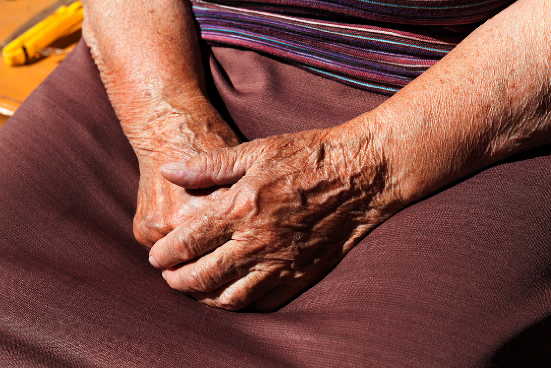
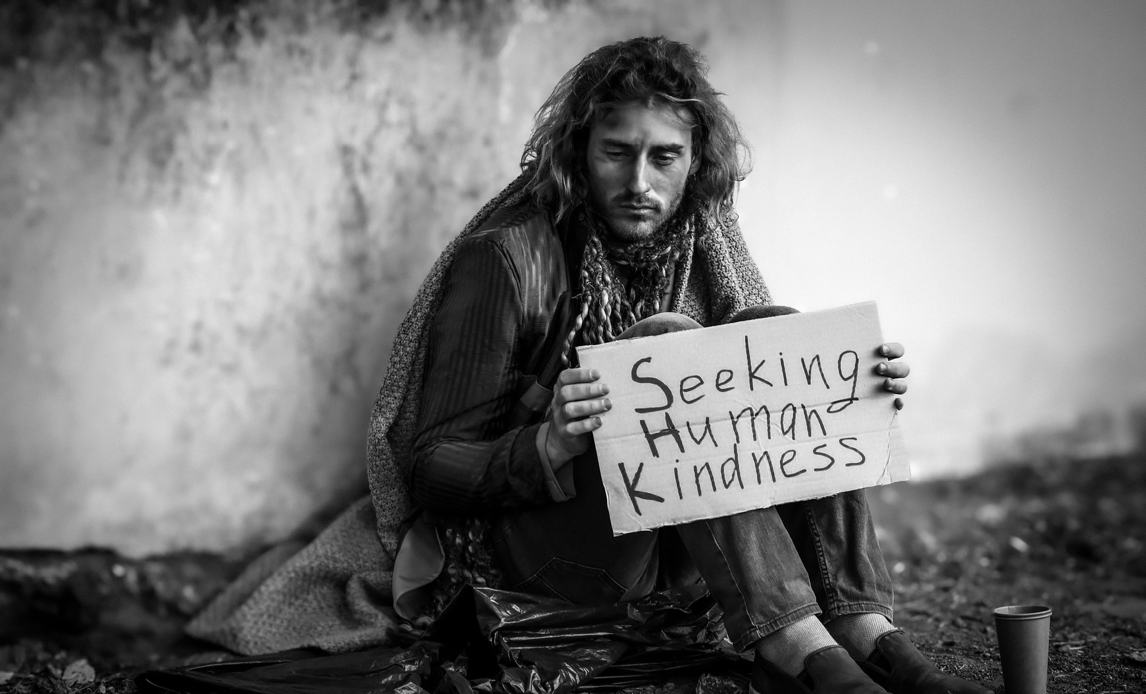
I created a photo story visualizing the importance of human compassion. Often, when we see unhoused individuals camped under bridges or street-sides, we feel a sense of helplessness. We experience a complicated mix of empathy, urgency, and helplessness. There is a paralyzing uncertainty in wanting to lend a helping hand, as the capacity to help may feel impossibly small. We may feel as though our attempts at help are only a temporary relief for such a huge systemic problem. It's important to understand that help does not need to be perfect for it to be valuable. Any act of compassion (even if it's imperfect) is never useless. Creating a sense of connection, dignity, and recognition can be shown through small acts such as donations, volunteering, advocating, and simply acknowledging the issue. Simple acts are the starting point for all meaningful change. A single person cannot fix everything, but it starts with one person. It starts with you.
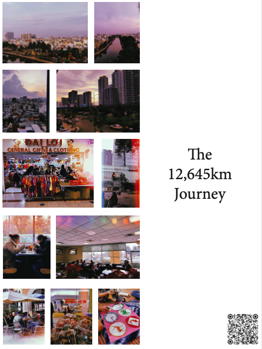
Huy Nguyen
This photographic exhibit showcases my 12,645 km flight from Hô Chi Minh City to Little Saigon in San Jose, California. The exhibit is arranged to reflect the journey taken by me, starting with a wide shot of the Hô Chi Minh City landscape and transitioning into smaller shots of Little Saigon, where Vietnamese culture and cuisine have flourished for decades. The exhibit’s title, “The 12,645 km Journey,” emphasizes the distance traveled while also highlighting the idea that cultures and homes are created and nurtured wherever we may find ourselves.
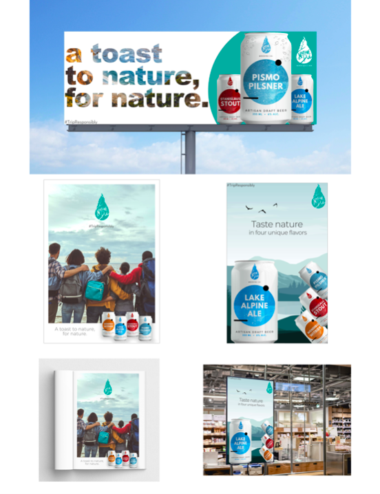
Regina Grajo, Cindy Tran
This set of advertisements was submitted as a part of the final project for ADV 91 in Fall 2021. It features a fictitious alcoholic beverage brand, Native Due. Cindy Tran created the brand style guide and designed the logo and product mockups. Regina Grajo designed the advertisements. The product is featured in traditional advertisement channels, such as a billboard, magazine, and poster.
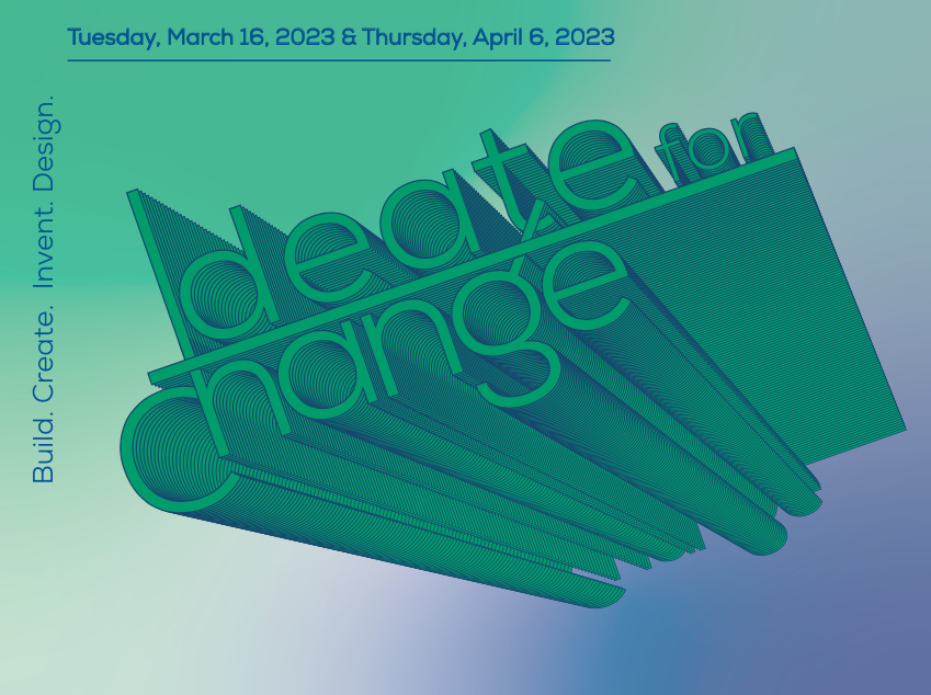
Brianne Badiola, Alexandra Hisen
Ideate for Change is a creative hackathon that challenges students to tackle real world issues over the course of three weeks. As a new event this year, Brianne and Alexandra were tasked with creating the branding identity, promotional assets, such as a poster and postcards, and social media strategy to build excitement for the event. The posters and postcards were hung around SJSU and nearby community college campuses. Brianne and Alexandra also tabled on campus to encourage sign-ups, resulting in 84 individual participants for the event. They also handled event planning, catering, and slideshow presentations for the overall event.
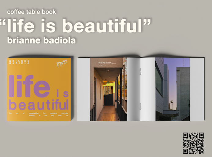
Brianne Badiola
"Life is beautiful" is a coffee table book, passion project, designed by Brianne. All images were taken by her as well using iPhone 13. The book was an experimentation as to how whitespace and layout composition could be could enhance a photo and the viewer's interpretation of the imagery.
Jasmine Shokoor
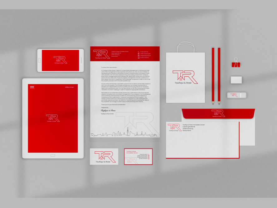
This stationary systems project was completed for Taufiquiand Rose Immobilien GmbH. This company specializes in real estate management in Hamburg, Germany. Their customers/audience are mostly German nationals that live abroad and have properties in Germany. For their logo, I used the outline of a roof with four windows with the letters T and R. This was the most aesthetically pleasing yet profesional-looking logo that highlights they are in the real estate market. I added their last names, “Taufiqui & Rose” under this logo as well to bring the identity of the owners. Throughout the stationary concept, I utilized colored variations of the logo on their website.
Cindy Tran
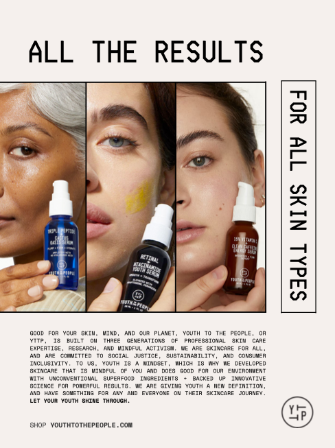
This mock out-of-home advertisement for Youth to the People was written and arranged by Cindy. Art direction and photography are credited to Up Close (byupclose.com). This project was an assignment for ADV 124, which was choosing a favorite brand and creating an ad with a body copy.
Caylee Tompkins
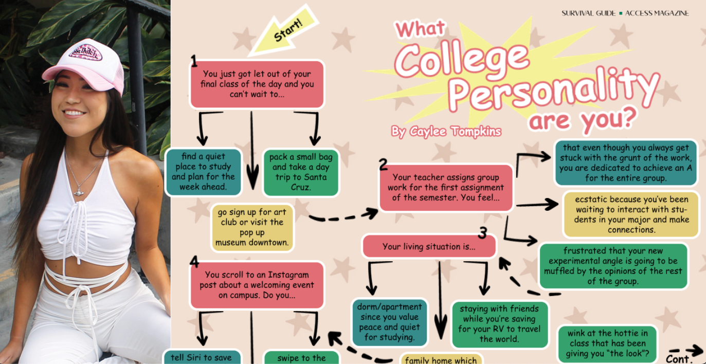
Inspired by the personality quiz trend present in the 90s and 2000s in mainstream publications such as Seventeen Magazine and Teen Vogue, I created a college-themed personality quiz for students in the Spring 2022 in addition of SJSU's Access Magazine. These stereotypical archtypes are intended to dramatize characteristics of common college-kid attitudes. I see myself in all of these profiles. Now let's see what type of college student you are! Find out by counting the colors of your answers to each question.